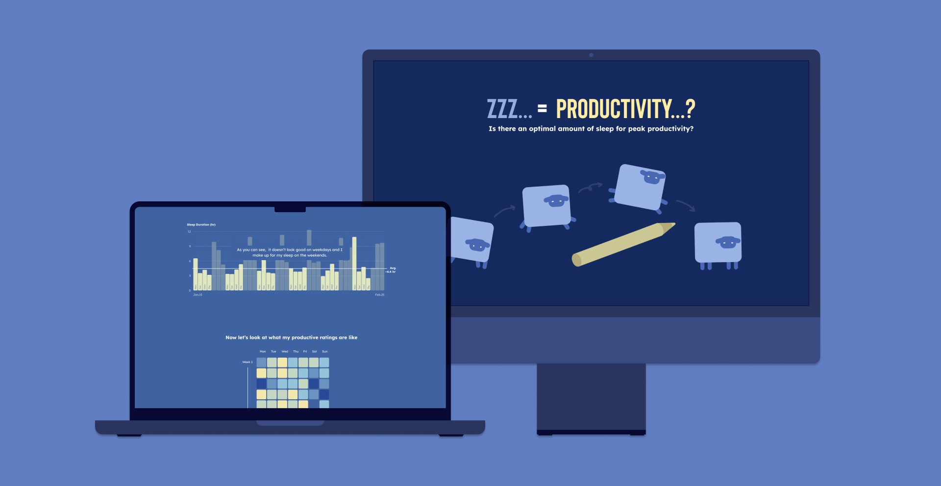


Zzz... = Productivity...?
Overview
A data visualization website designed to document my findings on the relationship between sleep duration and productivity.
Tools
Team
Personal Project
4 Weeks
Sleep Vs. Productivity
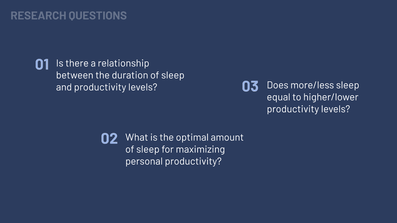
Sleep is important for a person’s well-being and performance. I have always been curious about how many hours of sleep would enable me to be the most productive and help me plan my work and sleep balance more effectively. So, I decided to create a visualization using my sleep data to hopefully prove a correlation between sleep and productivity levels.
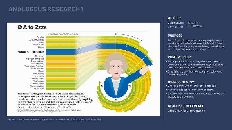
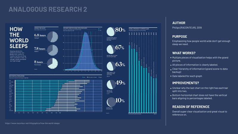
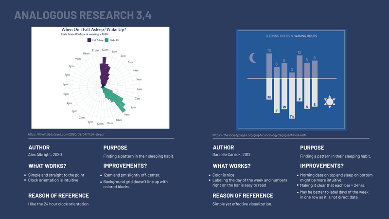
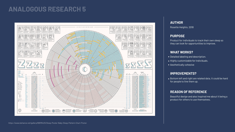
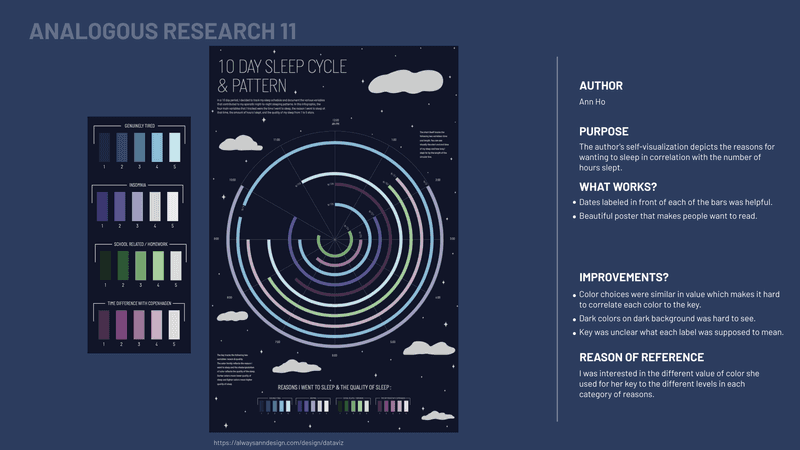
Analogous research
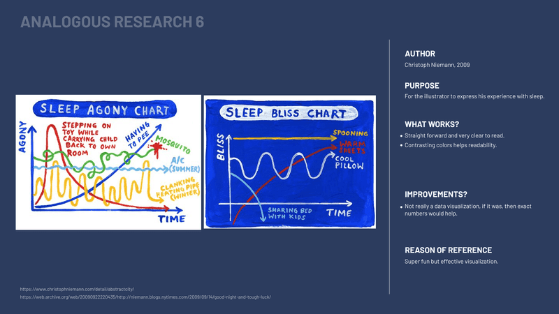
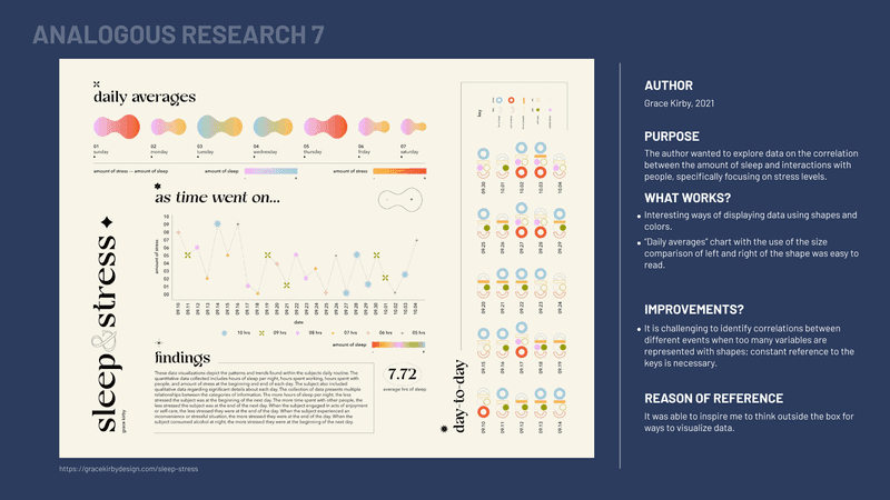
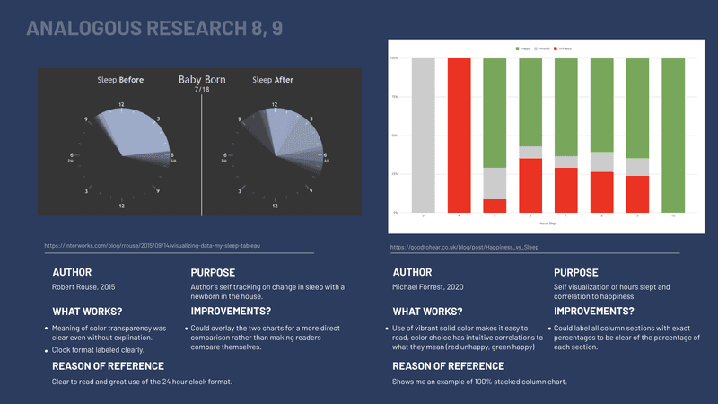
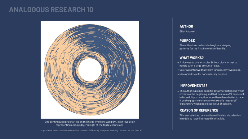
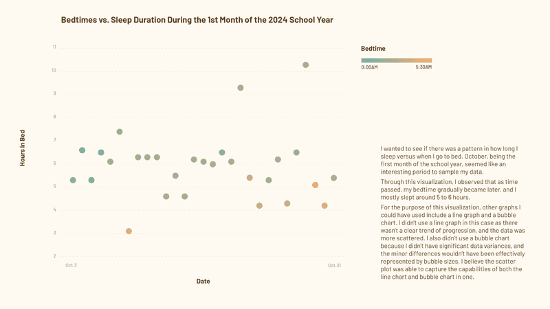
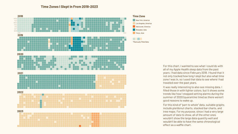
To start, I researched similar existing data visualizations on the topic of sleep and analyzed them to see what I could learn from each.
Concept Direction
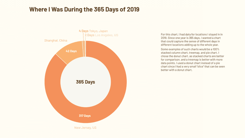
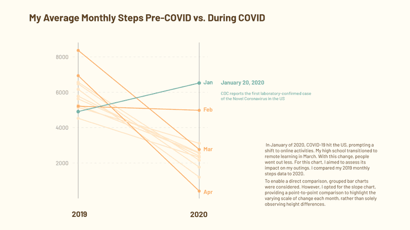
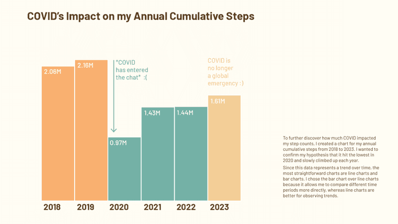
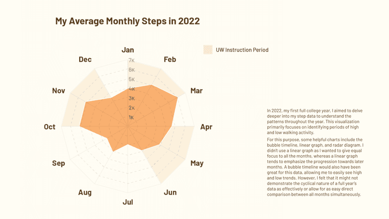
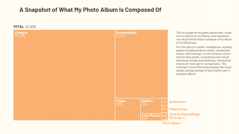
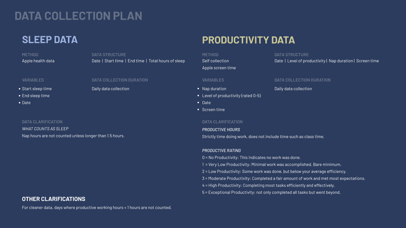
I experimented with different charts and data from my daily life using existing data from my phone, such as walking, sleeping, and location data, and tried to come up with interesting ways to visualize them.
Evaluate & Define
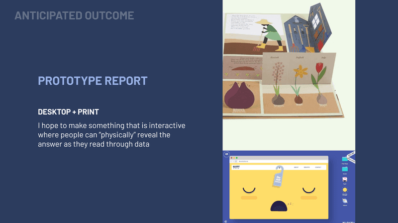
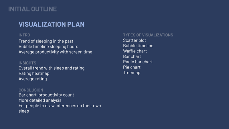
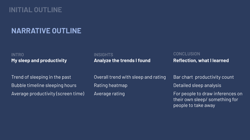
Defining visual direction and further exploring the nap timer concept.
Style exploration
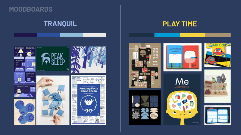
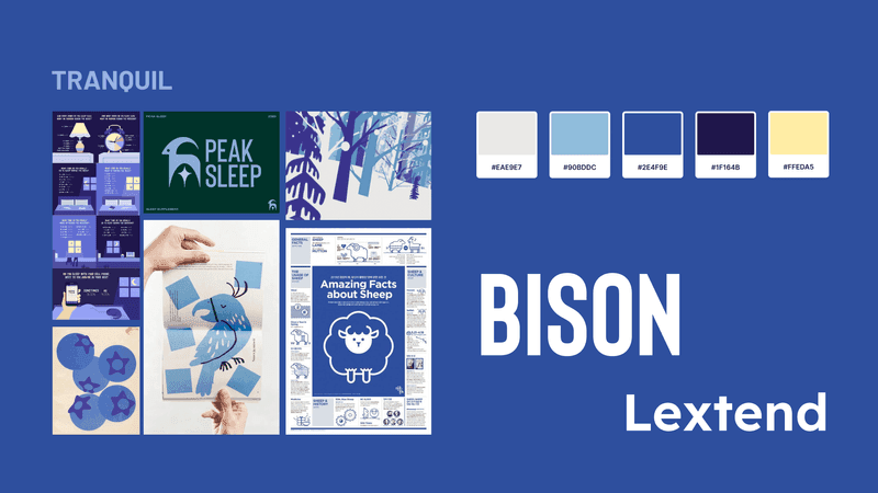
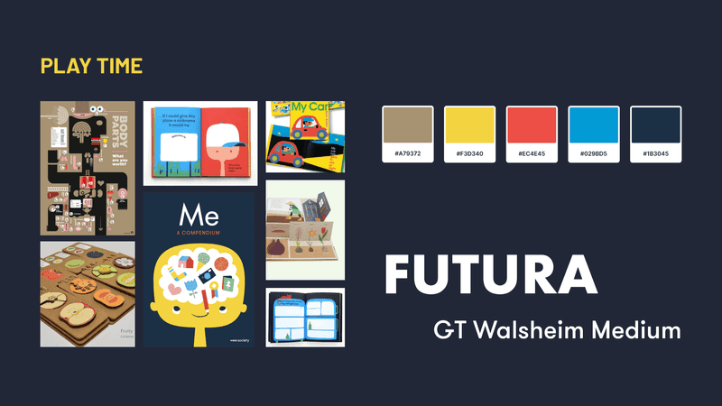
Expanding on the moodboard I created, I explored two style directions: one with calming blue hues, and the other experimenting with children's book styles.


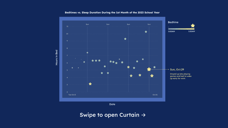
Making Data Visually Engaging
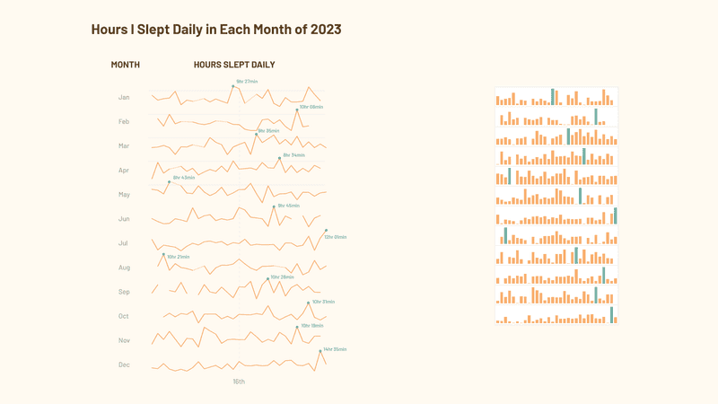
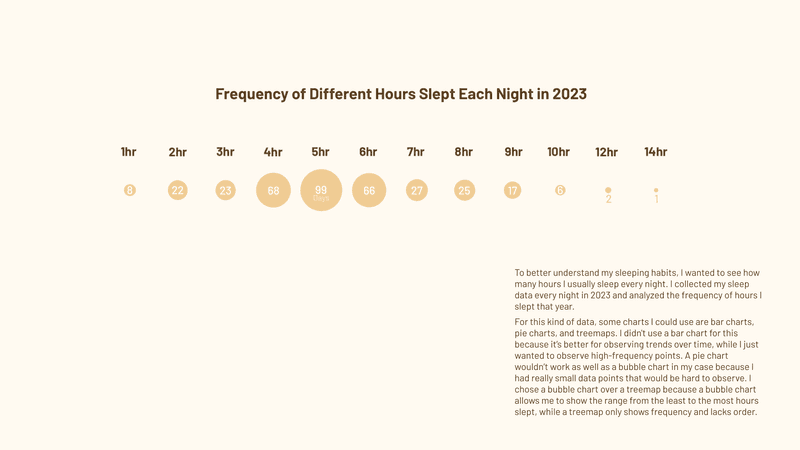
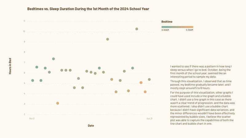
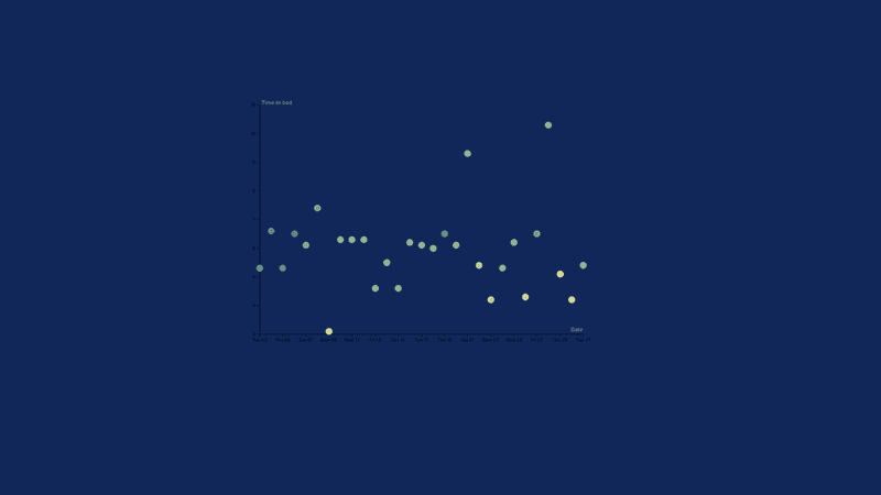
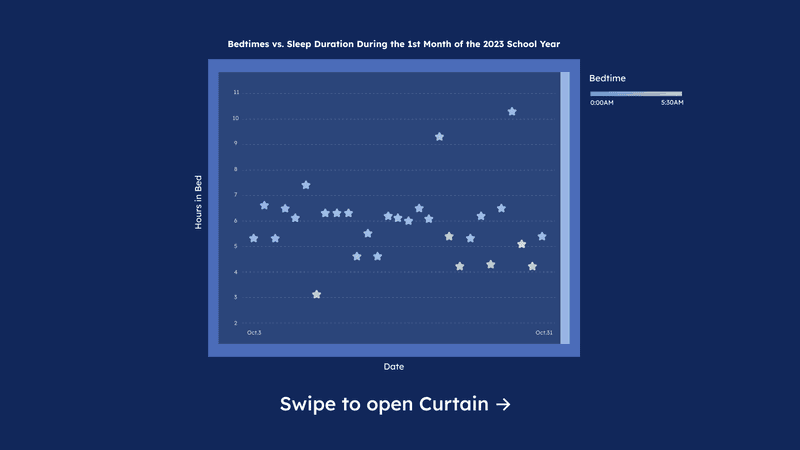
During the process, I spent a lot of time optimizing my visualizations to be easily understandable and enjoyable to read.
I went through many iterations, and this was one of the graphs I spent the most time on.

Website Prototype
Full screen for the best experience. Press ENTER to move through pages.
Find Out How Much Sleep YOU Need
key takeaways
Through this project, not only was I able to explore Figma component animation more, but it also allowed me to examine my life habits more closely and to use data as a means to confront my bad habits.
Challenges
Collecting data wasn’t as straightforward as I’d hoped.
Without a fitness watch, I had to manually record everything, which led to miscalculations, logging mistakes, and data mismatches. I redid the final graph over 10 times.
In the future, I’d ensure the data is accurate before graphing, and Google Forms might be a better way to record data than Excel, as it’s easier to make mistakes and track history in Excel.
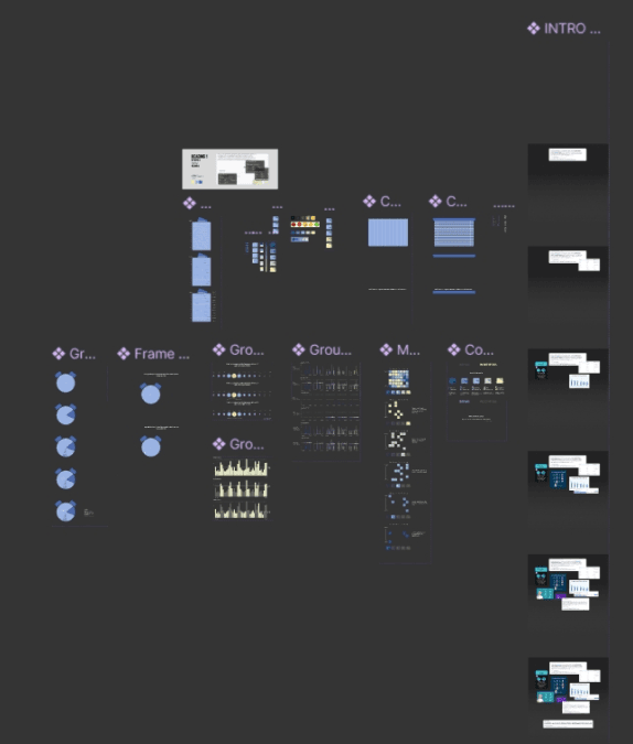
behind the scenes 👀
Ft. a million comments I left for myself and my proud Figma components gallery.
